❶
The House That Flew
Up House / Airbnb
Stakeholders: Airbnb, Disney, Pixar, Verb Agency, PBZ
The Conversation.
As with all great conversations this one came in marked ‘almost impossible’. The project needed to function simultaneously as an Airbnb destination, a media story, and a faithful recreation of one of animation’s most beloved homes while also maintaining structural integrity while being lifted off the ground.
Every design decision had to balance authenticity, practicality, guest experience and budget.
My Role.
I joined the project during creative development and received the brief to ‘recreate the Up House, and make it float’. Fun right? I developed solves for the project while also exploring the interiors, programming, logistics and scope. Once the pitch landed a fabrication team was brought in to handle the exterior and structural builds while my agency PBZ took on the interior immersive spaces.
What Interested Me.
The challenge wasn’t recreating the house.
The challenge was recreating the feeling.
People don’t remember the dimensions of the house from the film. They remember how it made them feel. Much of the design process focused on identifying which details carried that emotional weight and which could be simplified. Once identified I moved onto the practical problems of scaling a fictional animated house into the real world in way that was authentic to the film while offering a real environment for regular size people. Carl has a very unique height.
Things I Learned.
Projects like this reinforce a lesson I’ve encountered repeatedly: authenticity isn’t created by slavishly copying every detail. It’s created by understanding which details matter most to the experience.
I also learned that lifting an entire house, once a day, for 30 days, via a crane is madness. Achievable but madness.
❷
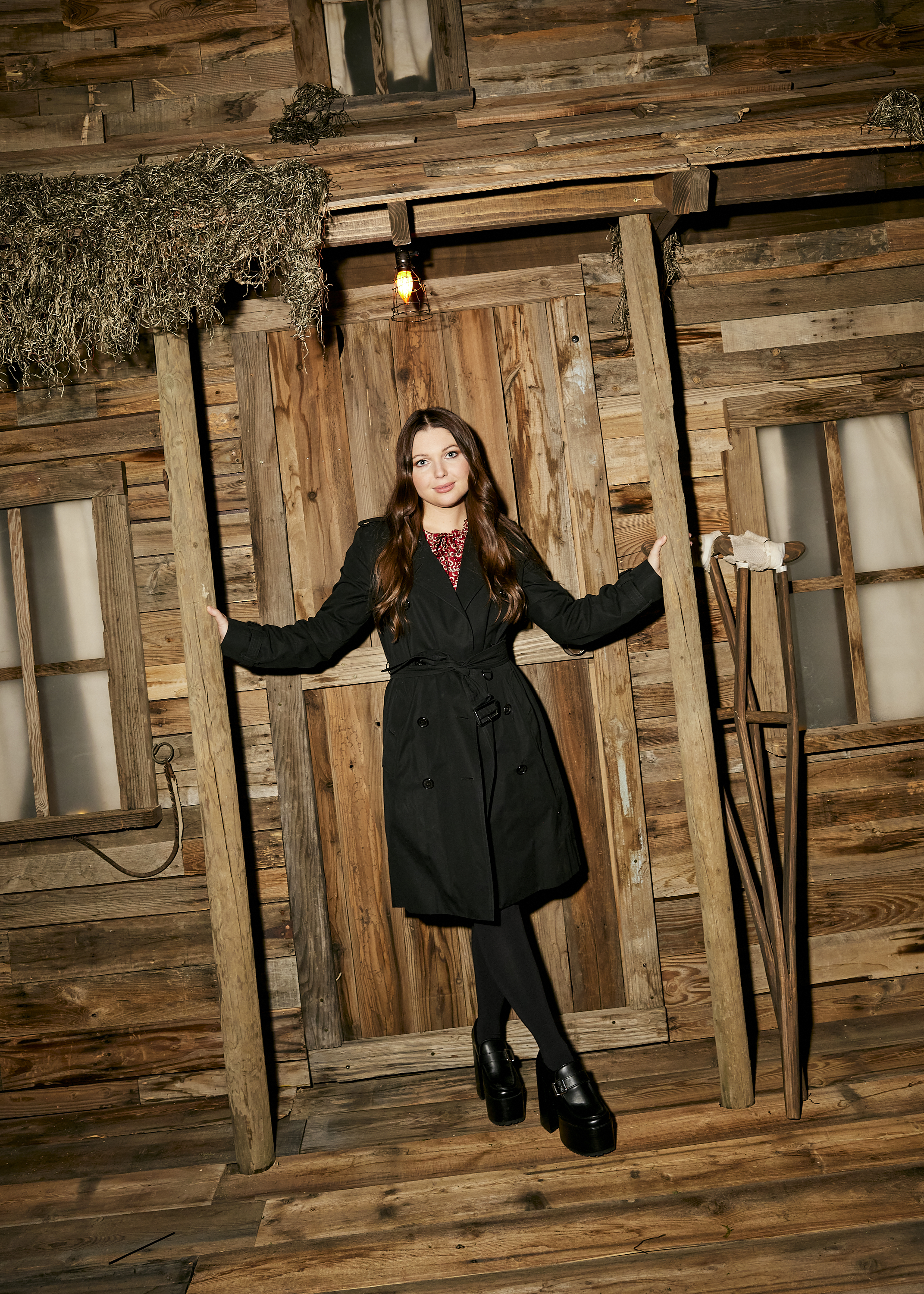
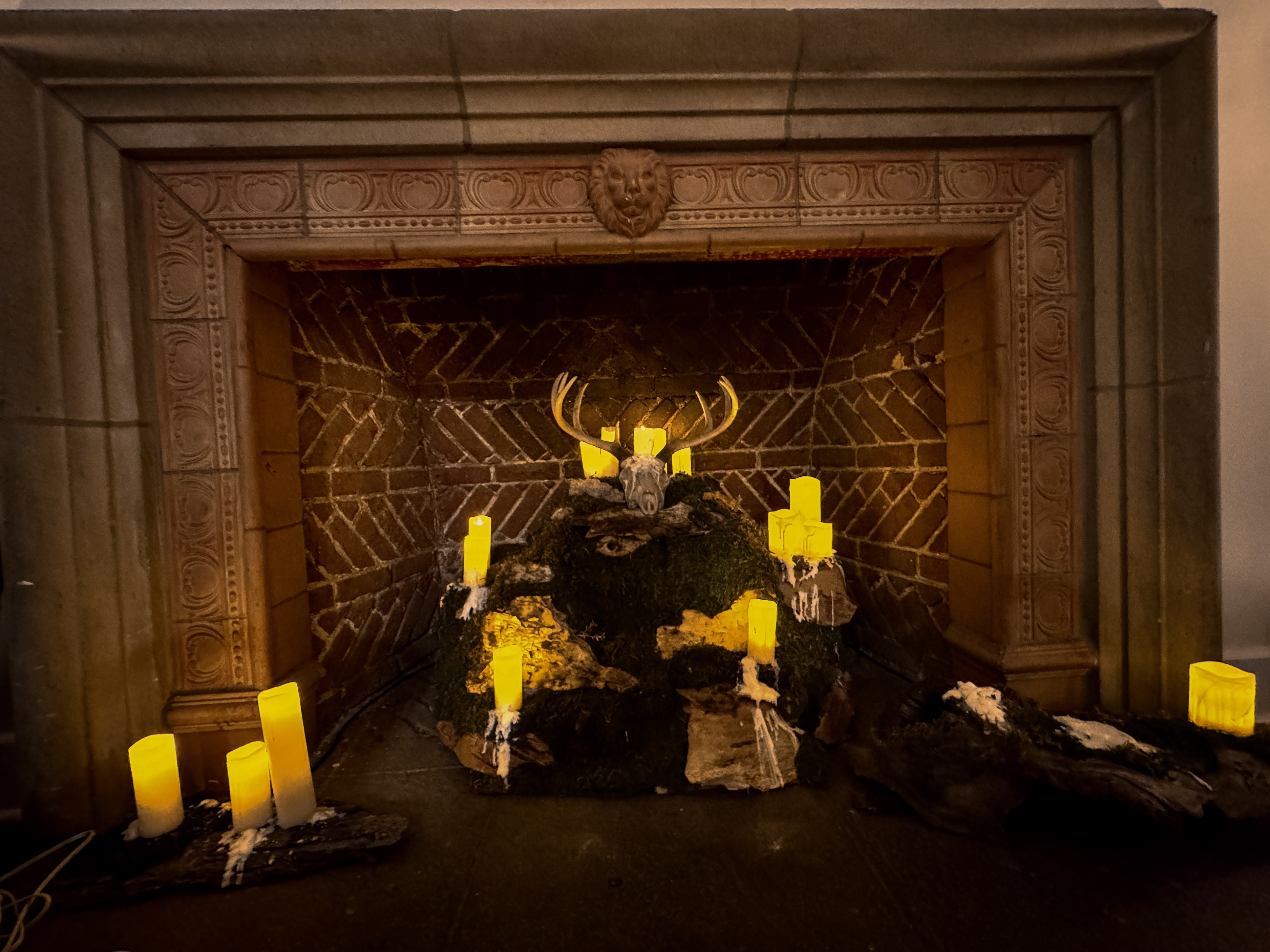
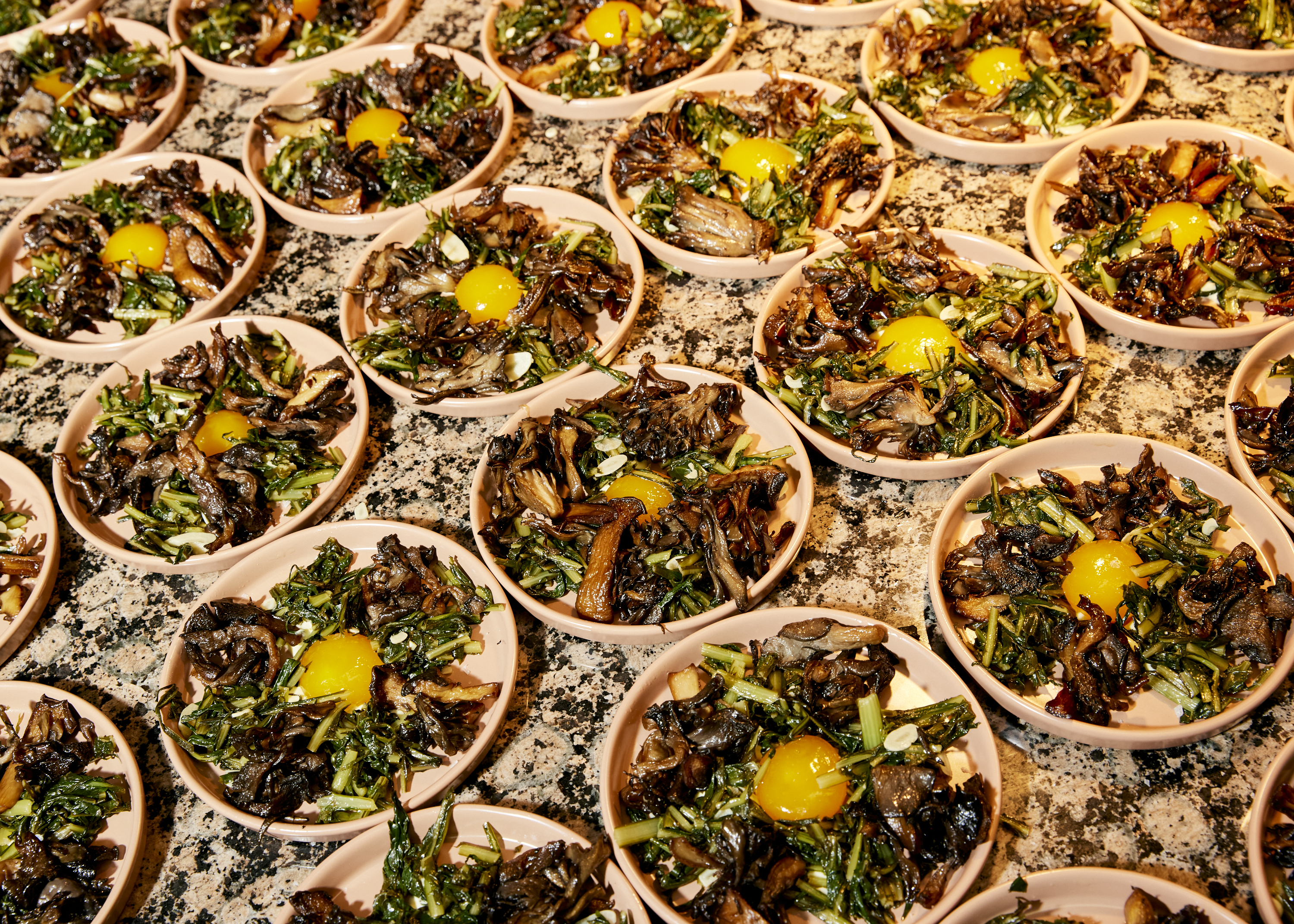
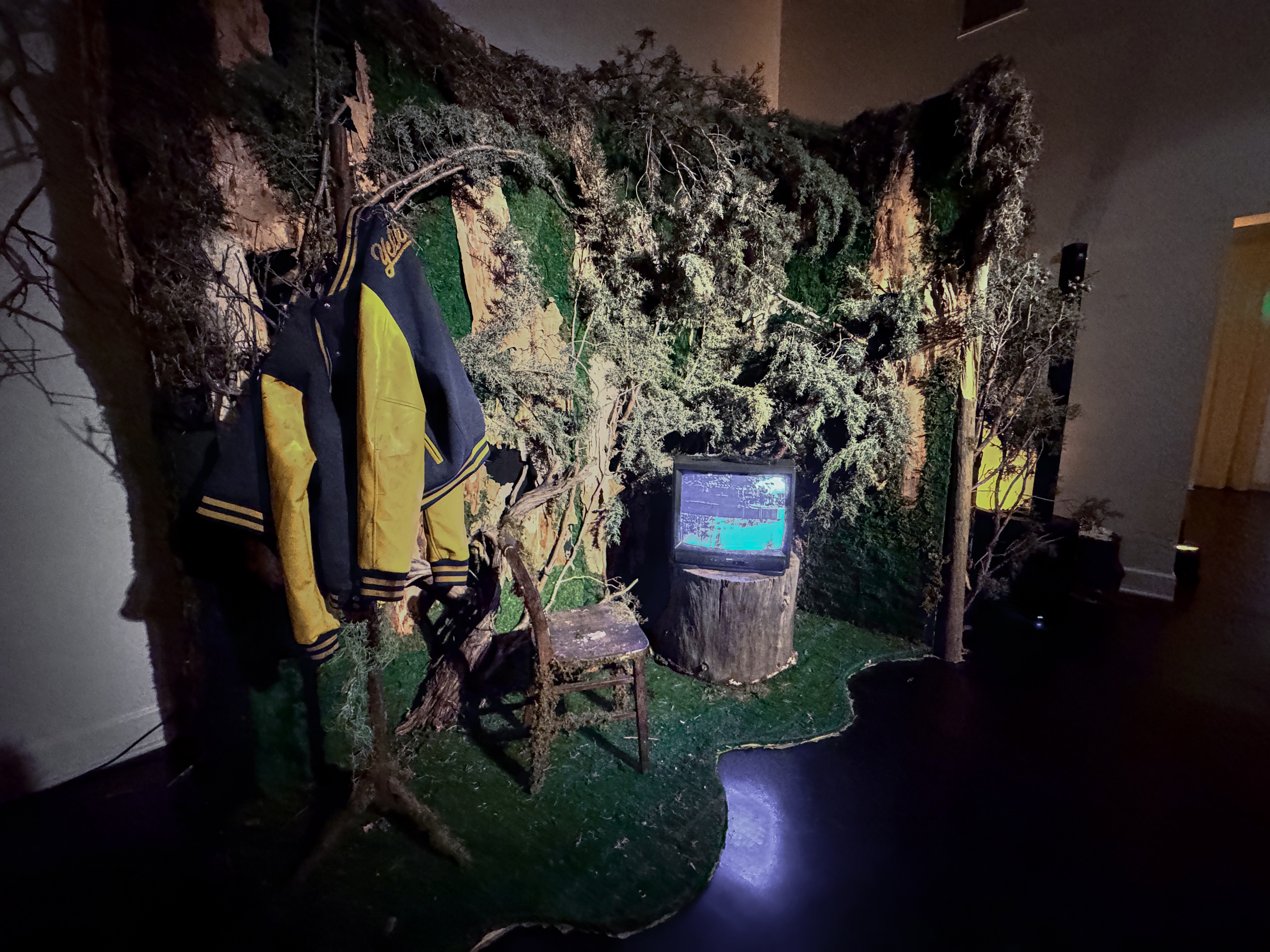
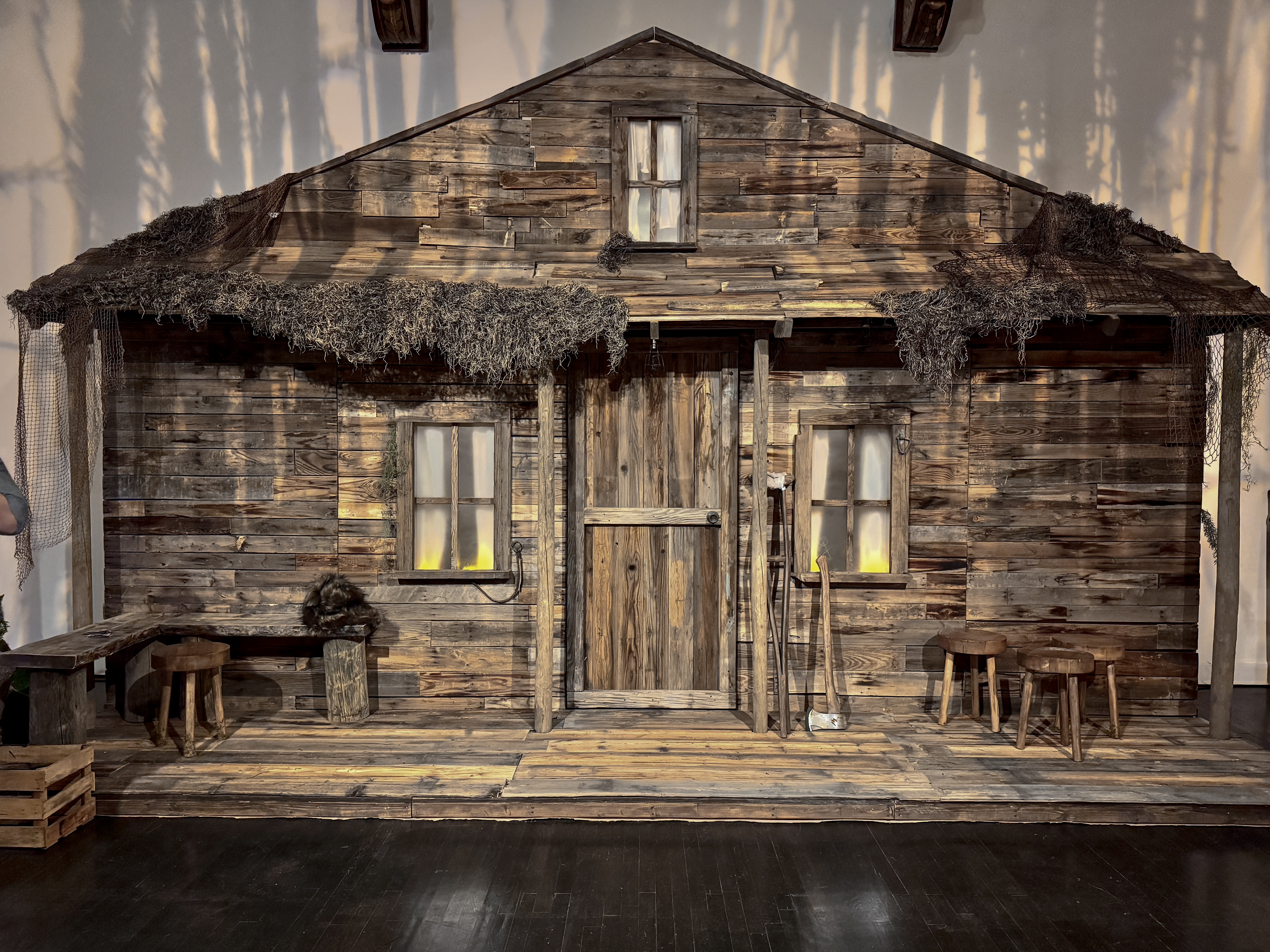
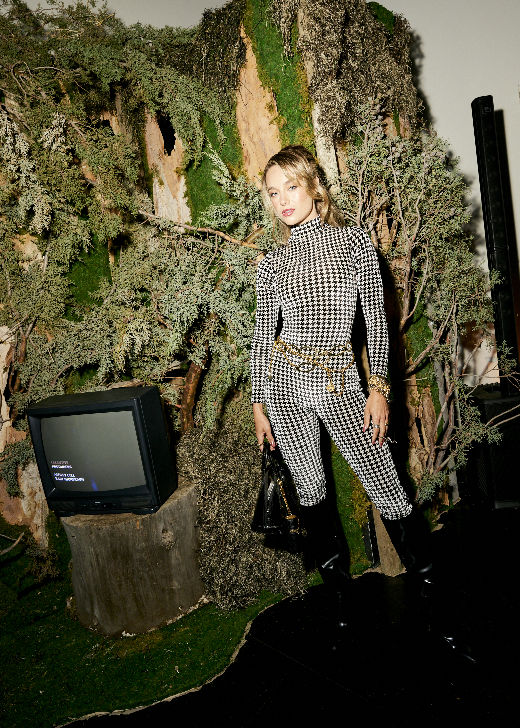
The Wilderness Inside
Yellowjackets / Paramount+
Stakeholders: Paramount+, Eater, Vox Media, Oma Loves Fun

The Conversation.
A conversation flow’s best between old friends so when Vox Media approached me about the launch of Yellowjackets Season 3, the goal wasn’t simply to create an event. It was to create an environment that felt as though it existed somewhere between reality and memory, something transportive, something otherworldly yet rooted fully in the terrors of nature. The series occupies a unique space—part survival story, part psychological thriller, part folk horror—and the challenge was finding a way to translate that atmosphere into a physical experience... while serving dinner.
A conversation flow’s best between old friends so when Vox Media approached me about the launch of Yellowjackets Season 3, the goal wasn’t simply to create an event. It was to create an environment that felt as though it existed somewhere between reality and memory, something transportive, something otherworldly yet rooted fully in the terrors of nature. The series occupies a unique space—part survival story, part psychological thriller, part folk horror—and the challenge was finding a way to translate that atmosphere into a physical experience... while serving dinner.
My Role.
As Creative Director, I worked with the Vox Media team and their vendors to develop the creative experience and environmental design. My role involved helping shape the creative direction, identifying the details and activations that would carry the greatest emotional weight, and working through my agency PBZ fabrication and production to bring the environment to life.
As Creative Director, I worked with the Vox Media team and their vendors to develop the creative experience and environmental design. My role involved helping shape the creative direction, identifying the details and activations that would carry the greatest emotional weight, and working through my agency PBZ fabrication and production to bring the environment to life.
What Interested Me.
What interested me most was the idea that the environment didn’t need to be a literal recreation of anything from the show. The audience already carried the story with them.
The challenge became identifying which visual cues, textures, materials and moments would transport the audience and create unease without ever feeling like a theme park version of the series.
The most successful immersive environments don’t explain themselves. They invite people to complete the story in their own minds.
Things I Learned.
People rarely remember every detail of an experience. They remember how it made them feel.
Projects like this reinforced the idea that atmosphere is often more powerful than accuracy. A handful of carefully chosen details can create a stronger emotional response than a perfect replica.
The goal isn’t to recreate reality. It’s to create belief.


❸
The Funeral Procession
The Cortège
Stakeholders: Jeff Hull, Visomnia, Brilliant Work

The Conversation.
The Cortège began with a simple question: what happens when theatre leaves the building?
Conceived by Jeff Hull, the project explored esoteric and challenging themes while existing in the space between performance, storytelling and environment. Rather than asking an audience to sit and observe, the experience invited them to move through a narrative unfolding across a landscape.
From the beginning, it was clear that the setting itself would become part of the cast.
My Role.
Working alongside Jeff and the broader creative team, I contributed to the development, design and realization of key set and prop design elements. My role spanned environmental design, fabrication strategy, prop making, creative problem solving and the countless practical decisions required to transform an ambitious idea into a functioning reality. Integrating into a cast of hundres of experts and working on cross functional elements while maintaining Hull’s original narrative vision was a key element to the project.
Working alongside Jeff and the broader creative team, I contributed to the development, design and realization of key set and prop design elements. My role spanned environmental design, fabrication strategy, prop making, creative problem solving and the countless practical decisions required to transform an ambitious idea into a functioning reality. Integrating into a cast of hundres of experts and working on cross functional elements while maintaining Hull’s original narrative vision was a key element to the project.
What Interested Me.
What fascinated me most was the relationship between story and place.
Traditional theatre asks an audience to suspend disbelief. The Cortège reversed that equation. The audience was physically present inside the world of the story, moving through it as participants rather than spectators.
That shift changes everything.
Every path, structure, prop and environmental detail becomes part of the narrative. The challenge isn’t designing a set. It’s designing a place that feels as though it existed before the audience arrived and will continue after they leave.
Things I Learned.
Projects like The Cortège reinforced a lesson I’ve encountered repeatedly: people connect most deeply with experiences that allow them to discover rather than observe.
Immersion isn’t created through scale or spectacle (although those can certainly help). It’s created through participation.
When people are invited to explore, interpret and make connections for themselves, the experience becomes personal. And personal experiences stay with us much longer than presentations.


❹
The City of Letters
LA28
Stakeholders: LA28, Creative Circle

The Conversation.
Talking about the city is one of the many traditions of Angelinos. However, Los Angeles is a difficult city to describe in few words.
Unlike many Olympic host cities, it doesn’t have a single defining landmark, architectural style or cultural identity. Los Angeles is sprawling, contradictory, fragmented and constantly reinventing itself.
I was invited to explore typographic and illustrative directions for some of LA28’s niche programmes such as Volunteers and Torch. The work focused on how typography might capture some of the energy, diversity and personality of Los Angeles while supporting the broader identity of the 2028 Games.
My Role.
Working as part of a specialised typographic illustration team, I ideated a series of visual explorations intended to provoke emotional and visual responses and expand the range of possibilities being considered.
The work included hand-drawn concepts, digital illustrations, visual studies and experimental directions that explored how type, symbolism and storytelling might intersect within the LA28 identity system.
As with many early-stage creative projects, the goal wasn’t to arrive at a final answer but to provide the larger LA28 creative team with a foundation they could build upon.
What Interested Me.
What interested me most was the tension between consistency and individuality. LA28 has thoughtfully, and perhaps controversially, created a changable asset for the 2028 Olympics where each iteration represents something different.
Most identity systems strive for clarity through repetition. Los Angeles often feels like the opposite. It’s character comes from collision, contrast and coexistence. Different neighborhoods, cultures and communities can feel like entirely different cities ands this is reflected in the brand guidelines for LA28. Constantly changing the A in each expression to represent another facet of our diverse city.
Illustrative typography offered an interesting vehicle for that exploration. Letters can function simultaneously as language, image, symbol and storytelling device. They can be structured and expressive at the same time.
Things I Learned.
Large public identities carry an unusual burden. They need to be recognizable, but they also need to be inclusive.
The most interesting systems often leave room for participation. Rather than prescribing a single interpretation, they create a framework that allows multiple voices to exist within the same structure.
The strongest creative systems aren’t closed. They’re invitations.


❺
Before It Exists
Nike
Stakeholders: Nike, BeCore

The Conversation.
Some of my favorite converstations are with Jen Fisch at BeCore. Most of our creative projects begin as a collection of half-formed thoughts, references and possibilities.
Working alongside Jen on a variety of Nike initiatives, I am often brought into the process before a concept has fully taken shape. At this stage, teams are exploring directions, testing ideas and searching for the spark that transforms a conversation into a project.
The challenge isn’t building something. It’s developing visuals and interpreting short briefs as a foundation for the larger team to imagine what might be possible.
My Role.
On these briefs I support early-stage creative development and aesthetic language through visual exploration and rapid ideation.
Using a combination of sketches, reference gathering, moodboards, AI-generated imagery and quick visualization techniques, I help translate abstract ideas into something teams can see, discuss and refine.
The work is intentionally fast, flexible and unfinished. The goal is not to define a final answer but to create momentum and accelerate decision-making.
What Interested Me.
I’ve always been fascinated by the gap between imagination and reality.
Most people can sense when an idea has potential, but it’s often difficult to articulate why. A rough sketch, an unexpected reference or a speculative image can suddenly make an abstract thought feel tangible.
What interests me is less the image itself and more the conversation that follows. The most useful concept work isn’t precious. It’s a catalyst and a foundational language.
In many ways, these explorations function as visual prototypes. They allow ideas to be tested, challenged and improved long before significant resources are committed.
Things I Learned.
Sometimes people need more information. Sometimes they need something to react to.
A quick sketch shown at the right moment can unlock a project faster than a polished presentation delivered too late.
The best concept work isn’t about predicting the final outcome. It’s about creating enough belief for the next step to happen.
All of the Nike projects I’ve worked on have been transformed and refined by other teams, other creative visions, into something showstopping and much different from where I started.
Ideas move forward when people can see them.


